Accessibility might seem like a bit of a buzzword making its way around, but in reality, it’s a key feature everyone should be considering in their websites. By definition, it is the practise of making your website usable by as many people as possible. And why would you not want that? So, this primarily includes people with disabilities and impairments, however you also need to consider other accessibility issues like inclusion for mobile devices and even slow internet connections. When it comes to accessibility the key is inclusion – if your website isn’t suitable for a certain audience then this means that you are excluding them. And if you’re excluding visitors, that’s a huge chunk of people that aren’t going to be happy with you! But at the end of the day, accessibility is the right thing to do – not just for your business and your customers but as a moral right to be inclusive to all, and it’s really important to understand what you can do to help.
Branding & Design, Websites.
Why you need an accessible website
So what exactly is accessibility in web design?
So why should you want an accessible website?
Something to understand is that having an accessible website doesn’t just mean that visitors will find it easier to navigate and use. It can actually help in many other ways like even search engine optimization! One of the first points to consider for this is using semantic HTML to build your website (HTML being hyper text markup language, and if you don’t know it’s basically the code that builds up the content of your website). Essentially this is the use of HTML to reinforce the meaning of the information in web pages. There are particular tags that can be utilized that are semantic friendly, such as the header and footer tags as you can see in the diagram. If your website is made up of non-semantic elements then search engines like Google have a hard time understanding your website. Screen readers, tools which blind people use to navigate the web, work similarly by using the HTML tags to understand the content and regions of the page. So by using semantic HTML effectively you are actually not just creating a more accessible website, you are improving its search engine optimization meaning potentially more traffic will be driven to your site! This is just one example of how creating a more accessible environment is beneficial in more ways than you might think.
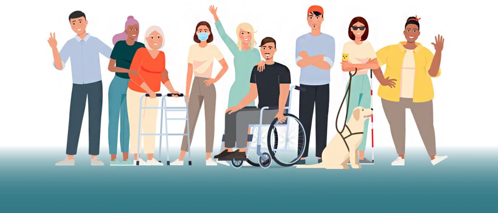
What types of disabilities and limitations should you be considering?
It would be easy to cater to a single disability and call it a day, however there are so many disabilities which all need to be considered – and more important, considered equally when building an accessible website.
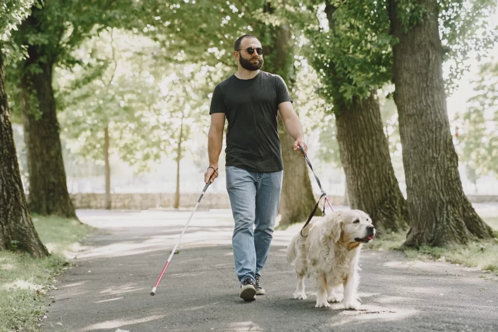
To start off you have visual impairments.
This could be anything from full blindness to low vision, or even other issues such as colour blindness. And the needs for these alone are varying.
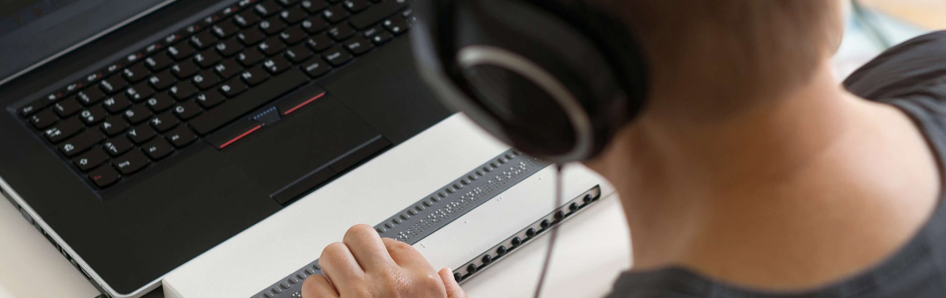
Blind people will require screen readers to navigate the web, these devices essentially convert the content of the web page to either read it out loud to the user, or convert it to braille for them to read.
People with colour blindness will need websites to meet contrast standards and colours that are common issues with colour blindness should be avoided. For example, people with deuteranopia might not be able to distinguish between the colours red and green, meaning any elements on a website that include the two will be nearly entirely unusable to them.
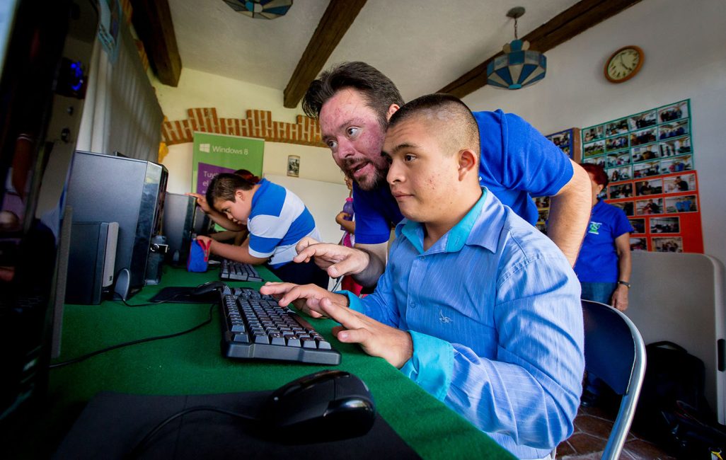
Other examples would be learning and cognitive disabilities.
To improve accessibility here your website should have a clean, well-organized look. You should also create high contrast environments to easily distinguish between content. For forms avoid providing too many choices or showing too much information on the screen at once. Providing easy to find and clearly identifiable buttons and links will establish a navigation that is accessible to these types of users. Other things to consider are using small blocks of text that use clear language with short sentences. And text should always be supplemented with imagery or graphics appropriate to the content to improve understanding.
Accessibility around deafness and hearing losses may seem unnecessary.
After all they can see your website, what more could they possibly need? Well for starters, providing multiple contact options – not just a phone number – ensures they will have a means of getting in touch. And videos should always have subtitles or accurate captions, including descriptions for non-spoken sounds like music, clapping, and laughter. Many deaf people have English as a second language, so using simple English and avoiding jargon can benefit accessibility for these groups too.
People with speech disabilities have difficulties producing or articulating spoken words.
As a result, for these users voice command features are not possible at all. They too, like hard of hearing users will need multiple contact options as phone calls may be difficult or impossible for them.
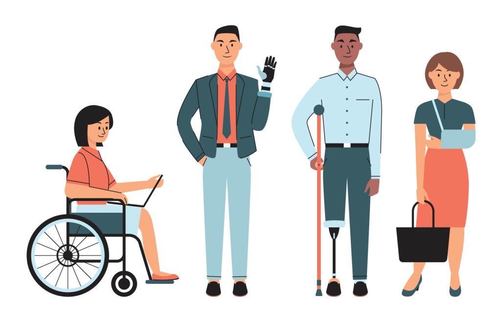
The last group I will be discussing today will be those with physical disabilities.
And these can vary from many conditions such as epilepsy, cerebral palsy, cystic fibrosis, muscular dystrophy, or even amputation, which could be anything from missing fingers, entire limbs, or other parts of the body.
To navigate the web more easily, people with physical disabilities often use specialised equipment. People with use of only one arm may require a special mouse or keyboard like this one handed keyboard here, where all the keys are easily within reach with the use of just one hand.
Head pointers are great for anyone paralyzed from the neck down. They attach to your head and through the use of neck movement the user can point the attached stick to use a touch screen. This is where larger elements are key as head pointers can lack the fine motor skills that come with a mouse.
Foot operated switches can be useful for those with poor hand function, these can mimic the input of a mouse. With there being such variety in the types and levels of physical disability it is difficult to cater to every disability however there are many steps that can be taken to streamline this process.
Providing full keyboard support is crucial so users can navigate through your website by tabbing through the elements that populate your pages. This is where semantic HTML comes bac into play, it is crucial for indicating the kind of elements that users need to focus on with keyboard navigation. Providing sufficient time limits when completing tasks such as inputting a verification code or filling out a form is important as some users may struggle to rush through these tasks otherwise. Finally, ensuring that all the interactive elements of your website are large enough so users that struggle with fine motor skills don’t experience any difficulties with them. This could be anything from buttons, to links, to form fields.
So how does a designer consider accessibility in their work?
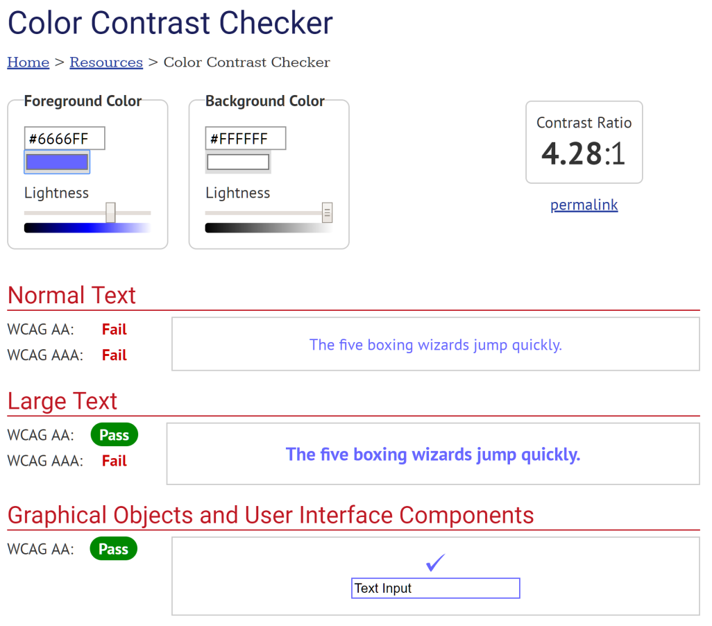
When we are in the process of designing a site with accessibility requirements, our first considerations are usually about the colour and contrast. There are online websites that we use to see if colours on my websites meet contrast standards – just google contrast checker, pick one of the options and plug your colours in. They will be able to tell you if your colours meet the standards.
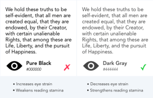
We tend to avoid using pure black text against a whiter background as contrary to what you might think, the extreme contrast can actually reduce legibility and be difficult for users with dyslexia and light sensitivity. A good alternative is to use a dark grey instead.
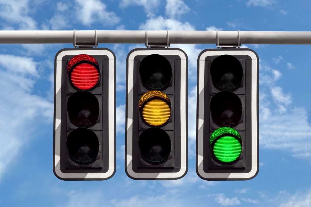
Make sure that you avoid communicating concepts with colour alone – for example using only the colour red to represent a warning. Using other indicators such as icons and text will help users identify different elements and their functionality. In this case it would be using the colour red and some text that says “incorrect email address”, for example, to provide further context.
For typography, you want to ensure a minimum font size of 16 pixels. This is considered readable by all accessibility standards. Sans-serif fonts – the ones without the extending features at the end of the strokes – are generally considered easier to read, however serif fonts can definitely still be used. You should never centre align or justify large bodies of text as this can be very difficult to read for people with dyslexia and visual disabilities, left aligned is always the best option.
Interactive elements such as buttons and links should be easy to identify, whether this be through the use of colour, shape, or style. There’s a theory that I like to use called material honesty which basically says, a house that looks like it’s built of brick must be built by brick and a house that looks like it’s built with wood must be built with wood. The same applies to websites – for example, something that looks like a button must be a button. same with links, same with forms.
Your website’s navigation should be clear and consistent with its naming, styling and positioning. Pages should be labelled plainly as they are. It also helps to provide users with orientation cues such as breadcrumbs and clear headings so they can orient themselves at any time.
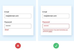
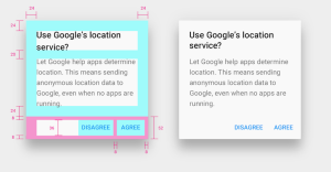
Forms should utilize simple styling so the fields are easily identifiable, and should always have a descriptive label adjacent to each field. Providing feedback like the correct example here where a password has been entered incorrectly can help users to identify the processes. These feedbacks should be presented in prominent fashion such as colour changes and text popups for the applicable areas of the form.
Finally, providing sufficient spacing between groups of content can help users identify the content, and headings should always be used to label the content so it can be quickly scanned and understood.
Similar posts
1st September 2025
Branding & Design, Software & App Development, Websites.
Can your website agency own your website? What every business should know.
We’ve lost count of the number of business owners who’ve come to us saying “I thought I owned my website… until I realised I didn’t.” It usually starts small - you can’t log in to make a quick change, or you have to email your agency for every little update. Then you find out your domain is registered in their name, not yours. Before you know it, your own website is effectively behind bars, and the only way to get to it is through them.
Read more
10th June 2025
Hosting & Security, Websites.
TimeZoneOne Website Hosting Shutdown? Webmad is Ready to Support You!
With the news that TimeZoneOne is shutting down hosting at the end of the month, many businesses are left scrambling to find reliable hosting services. If your website is still hosted by TimeZoneOne, now’s the time to act to avoid going offline. If you’re looking for a flexible, long-term partner who can offer clear, affordable website hosting Webmad is here to help
Read more
23rd May 2025
Software & App Development, Websites.
NZ 2025 Investment Boost: What It Means for Your Business
The 2025 Investment Boost is a key initiative in the New Zealand Government’s 2025 Budget. The scheme allows kiwi businesses to immediately deduct 20% of the cost of new business assets – including websites and software – on top of standard depreciation.
Read moreLet's make something great together.
"*" indicates required fields
69 Corsair Drive, Wigram, Christchurch
PO Box 16760, Christchurch 8441