It’s no secret that colours can make people feel certain ways. But did you know that this power can be harnessed to create websites that subconsciously affect the way users might interact with your website? What might seem a simple choice of colour is a rigorous process many creatives go through when designing a website. So, what does this mean for your website? And how can you learn the power of colour theory and apply it yourself? Some designers spend years studying this, mastering the ins and outs of every shade. There are some key points, however, that anyone managing a website needs to know.

Branding & Design, Websites.
What is colour theory and what does it mean for your website?
How colours may be affecting your website
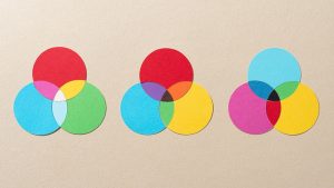
Different colours and how they make us feel
There are associations with every colour, and it is important to cover the most common ones for your benefit.
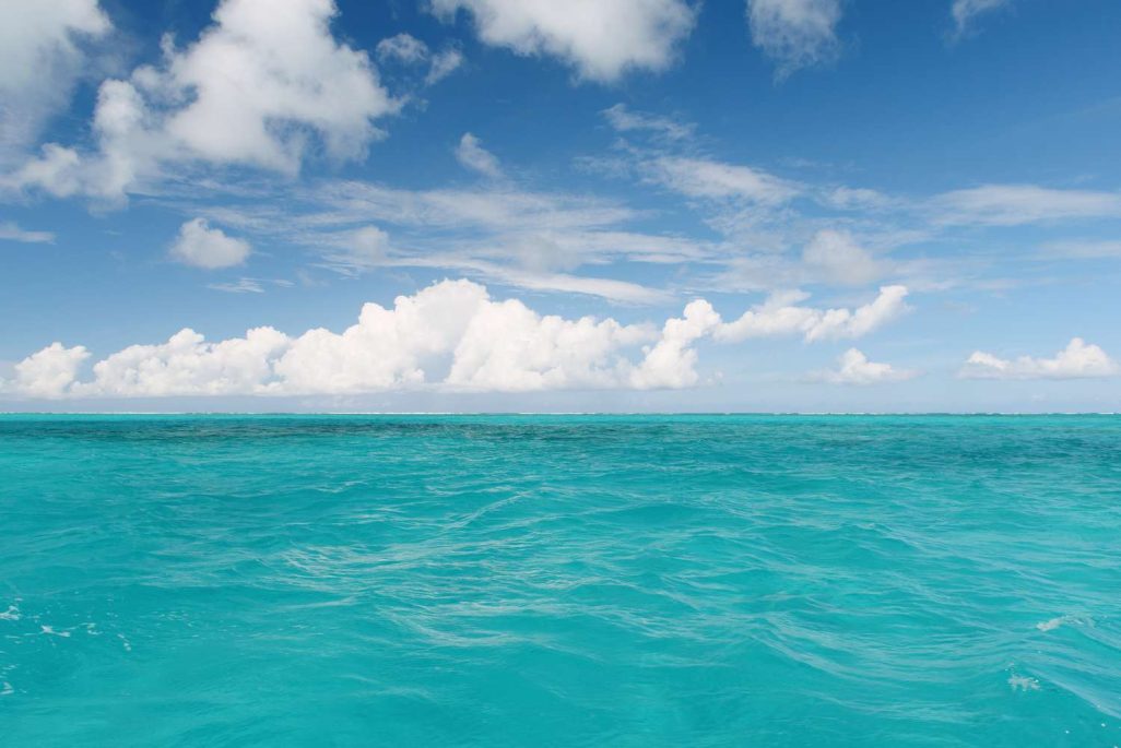
Blue, as we discussed earlier represents reliability and trust, as well as other emotions such as tranquillity and calmness possibly due to its association with water.
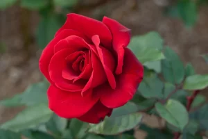
Red is a very strong colour and therefore comes with strong emotional association. Anger, love, and anguish (from red being the colour of blood) are all common colours seen here.
Orange is a very pleasant warm colour and represents energy and creativity.

Yellow is the colour of sunshine and therefore associated with joy, happiness and energy.

Green is associated with growth, health and luck. It directly symbolizes nature and is widely used to promote environmentally friendly products and brands.
Purple is often associated with royalty (fun fact: this is due to purple being a very rare and expensive dye colour in ancient roman times!). It symbolizes power, luxury and wealth.

White directly represents purity and goodness, however it can also represent coldness and winter.

Black is associated with power, authority, and strength. It is a great choice for brands due to its timelessness.
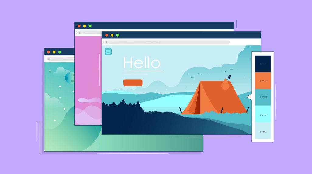
How designers use colours in websites
There are many tricks that designers use when incorporating colours into website designs. Usually, the first considerations are around branding and brand colours. Are the brand colours going to be enough for the website? Or should a complimentary colour be chosen to emphasise the design. For example, a brand with 5 colours might not need a complimentary colour however a brand with only blue might look at incorporating, for example, yellow into the designs. The brightness of the yellow would help to bring out the blue and emphasise the brand throughout the website. Colour choices could also come down to matching the product or service you provide. Is it a company that plants trees? Green would be the obvious choice. A website for romantic gifts? Anything but red would seem strange! There are also considerations around other colours which many people may not think of. The colour of fonts throughout the site is very important, will your text be black on white? Or maybe a tone of grey would suit the text better. Having header text be a different colour to body text also allows for users to quickly differentiate between the types of content on your site. And subtle choices like should the colour of a button change when a user hovers over it? There are many things to consider when designing a beautiful site, and these are all things that designers work through with their processes.
What are the current colour trends?
Colours are constantly coming in and out of trend and it can be difficult to keep up with what is currently popular. There are a few choices which are popping up now that should be a consideration when choosing colours for your website.

Pastel colours are usually described as soothing. These are usually pale and have high value and low saturation. Great for more crafty websites, they really fit the cozy vibe.

Who doesn’t love a throwback? The big trend at the moment is retro arcade, meaning a lot of bold distinguishable colours. Due to the old arcade systems having either 8-bit or 16-bit systems, the choice of colour was limited to the common bright choices you see associated with this era. 4 or 5 equally bright colours are chosen and used together and interchangeably in this unique trend.

There is a dual-tone trend of finding a primary colour, then picking a secondary colour which is a shade of the primary. This means you might end up with a deep blue as your primary and a more washed-out version of this colour as the secondary. This allows for a minimalist style to thrive and is popping up around more trendy sites currently.
Similar posts
Digital Marketing, Websites.
Local SEO in New Zealand: How to Get Found in Your Suburb
If you’re a small business owner in New Zealand, chances are your customers aren’t across the country, they’re just down the road. Whether you’re an accountant in the city, a plumber in Papanui or a builder in Ashburton, local SEO is what helps customers in your area find you online. Plus, people love going local when it ...
Read moreHosting & Security, Websites.
Weekly website woes ep2 – Suja Organic
Each week we feature one international website, whether overall good or bad, and pick 3 things they could improve about the site (in no particular order). In 2015 Suja Juice was rated as one of Forbes most promising companies. Where have they got to now?
Read moreSoftware & App Development, Websites.
NZ 2025 Investment Boost: What It Means for Your Business
The 2025 Investment Boost is a key initiative in the New Zealand Government’s 2025 Budget. The scheme allows kiwi businesses to immediately deduct 20% of the cost of new business assets – including websites and software – on top of standard depreciation.
Read moreLet's make something great together.
"*" indicates required fields
69 Corsair Drive, Wigram, Christchurch
PO Box 16760, Christchurch 8441


